2/ Select social impact indicators with confidence– checklist for good indicators
How much change has taken place? This is the second in a two-part guide laying out how you quantify a social outcome by selecting reliable and actionable indicators.
The posts should give readers the confidence to select and defend a set of indicators that measure their outcomes. The first section walks you through the decision-making process of selecting an indicator; and this second half can be used as a checklist for ensuring you have a good indicator. In summary:
1. How to select an outcome indicator - last post
2. Checklist for good outcome indicators - this post
Indicators should be selected to quantify the most important outcomes you identified when developing a Theory of Change. Go back to that step if you haven’t first mapped your intended outcomes.
Checklist for good outcome indicators
The following checklist will help you test and stretch your indicators to determine which should be prioritised for each outcome. It will also help you to avoid common pitfalls when selecting indicators.
Take your draft indicators and ask yourself if they reflect the following characteristics:
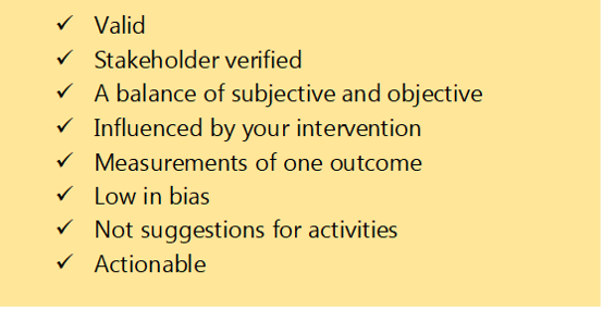
Each of these characteristics are discussed below.
Good indicators are valid
Indicators are a way of knowing whether (or not) an outcome has taken place.
Good indicators originate from asking how we can most accurately know an outcome is being achieved. They are relevant to, and fully capture your outcome - also known as construct validity. Bad indicators come from looking around and asking what can most easily be counted.
Think about those reports which describe the activities delivered, how much money was spent, and how many hours were volunteered. This kind of improvised impact reporting is still a common pitfall in outcomes measurement. It can easily be spotted because it asks us to stretch our imagination to link things like “volunteer hours” with outcomes like “increase in skills”.
Good indicators are stakeholder verified
Indicators should be in clear, concise language that is understandable and meaningful to your respondents. A simple way of checking indicator clarity is to ask your stakeholders if they think the indicator is a reliable sign of the outcome.
For example, I worked with a youth service to understand healthy friendships. We asked the young people if they thought the indicator “are there people in your life whom you could ask for support in a time of crisis?” was a good way of measuring friendships.
They told us that this was confusing, because they would probably go to a carer first (like a parent) in a time of crisis before a friend. Instead, they suggested it was about “mates who are always interested in what I have to say”. Using the language (like “mates”) which is common to your stakeholder group will also unlock better responses.
Good indicators balance subjective and objective metrics
A rule of thumb is to have three or more indicators per outcome. Three indicators will give you a chance to triangulate, validate and spot any outliers in the data you gather. Within those three indicators it is helpful (although not always necessary) to have a balance of subjective and objective indicators.
Yes, indicators can be subjective data; and they often are subjective in social impact research. Subjective data represents thoughts, feelings and opinions. It might be an indicator for social wellbeing like “how would you score the statement: I’ve been feeling close to other people”.
Many people are nervous about subjective data because they think it is less defensible than objective data. However, most social impact outcomes are psycho-social, so the most reliable way of knowing whether they have taken place is to ask people about what is happening for them on the inside.
Filling social impact reports with objective indicators is a common pitfall. Returning to our example above, an equivalent objective indicator for social wellbeing might be: “how many hours have you spent with other people this week”. However, this data will be riddled with unknowns, for example a dysfunctional or abusive relationship could look very positive in the light of this indicator.
Good indicators are influenced by your intervention
I often see organisations shooting too wide with their indicators. They may include one single indicator for example for mental wellbeing, like a rating on life satisfaction. The trouble with a big indicator like this, is that it is influenced by many variables. And let’s be honest, it is probably only influenced a small amount by your intervention.
It is better to focus on the component area of wellbeing that your intervention influences. For example, if you are running a befriending service, you might ask about feelings of inclusion or reduction in loneliness.
Attribution indicators (impact blog to follow) will go some way to correcting any overclaiming on compound or higher order indicators. However, the most common result of picking high-level indicators is that you measure no change regardless of your good work.
Good indicators are measurements of one outcome only
Your indicator should ask about change in one thing only. This sounds obvious, but it is easily to slip into composing questions which sweeps up multiple indicators. This is called “double-barreled” questioning.
For example, you might want to find out about the quality of someone’s relationships and ask, “Have you been feeling secure and understood in your primary relationships?”. This can be hard for someone to answer. What if they feel secure, knowing that their significant others are there for them, but not fully understood? Or what if they feel understood by someone but can’t depend on them?
Watch out for that sneaky word “and” in your indicators and see if you need to separate topics into two indicators, or to prioritise the more relevant area.
Good indicators are low in bias
Bias is everywhere and while you will not be able to eliminate it entirely from your indicators, you can select indicators which keep it to a minimum. Addressing all the characteristics in this checklist will reduce your bias substantially, but there are a couple of bias types which frequently pop up when designing social indicators:
· Social desirability: this is where the indicator attempts to gauge people’s opinions, feelings or behaviour in relation to something that is either desirable or stigmatised.
Behaviour change measures often attract this bias. For example, if you asked someone to rate their adherence to coronavirus lockdown rules, they are more likely to over-estimate their compliance because they have both a moral and legal obligation.
This bias can be minimised by rewording the indicator, breaking down the (socially desirable) concept into component parts, or by prefacing it with a normalising statement that appeals to their honesty.
· Recall bias: this is where the indicator may overly rely on the completeness of someone’s memory. For example, you ask them to rate how they were feeling a month ago, or even what they ate for dinner! This can be reduced by putting a near-term parameter around the indicator like “Yesterday, overall how happy did you feel…” or “Over the last two weeks, how would you rate…”. Sometimes we also try to anchor the indicator to a memorable event in the period we are interested in, for example, “Think back to last Christmas, to what extend did you….”
· Comprehension bias: this can creep in when the respondents to a survey are asked to make judgements on things that they do not fully comprehend. For example, asking children to rate their emotional intelligence.
Good indicators are not suggestions for activities
An important pitfall to avoid when creating indicators is prescribing delivery activities and/or creating perverse incentives.
I worked on an evaluation looking at the effectiveness of a community organising programme. The underpinning philosophy was to take time to listen to local residents’ concerns and visions. Effective engagement was largely judged by the number of doors that the organisers managed to knock on.
This created two problems. Firstly, the indicators prescribed an activity, meaning the organisers who listened to people in places other than on peoples’ doorsteps, looked less effective.
Secondly, good quality engagement and listening was dependent upon having a meaningful conversation. However, the organisers could count short, dismissive interactions toward their total number of door knockings. This created a perverse incentive to keep the listenings short and shallow.
Good indicators are actionable
Actionable indicators give you information that you can respond to in the design of your intervention. You should have options for responding immediately if you have met the checklist criteria above on “Good indicators are influenced by your intervention”.
Actionable indicators are also practical in terms of data collection and analysis. Biting off more than you can chew is a common pitfall in impact analysis. If your team rolls their eyes at the thought of additional data collection, then you might be measuring too much.
There is no point in over-cooking an impact evaluation in the hope of achieving more rigour, when you end up compromising the response rate. As a rule of thumb, surveys should take no longer than 15 minutes to complete and should be appropriate to the abilities of your respondents. Wherever possible bake data collection into the service delivery, and do not be afraid to remove indicators that you are not using.
In terms of analysis, you need to have enough credible indicator data to action an analysis. Another pitfall I often see is the selection of indicators for which there is insufficient (or unreliable) historical data to analyse a change. This is most common for objective indicators, for example, “number of professional partnerships” during a period, when many of these partnerships may have been fluid without proper documentation.
Final thoughts: how to select an outcome indicator
We all know what bad data looks like when we see it. We can smell something fishy even if we cannot articulate why we find it unconvincing.
To design strong indicators that you feel confident to defend, follow Part 1 of this guide. It will walk you through how to select an indicator and compose a survey question where appropriate.
This checklist will further help you in testing and refining your choice of outcome indicators. The most fundamental element to get right is construct validity: picking an indicator which really represents the change you are trying to measure. Take your time with stakeholders on this step before then ensuring they are balanced, sensitive to your intervention and actionable. Good luck!